In progress

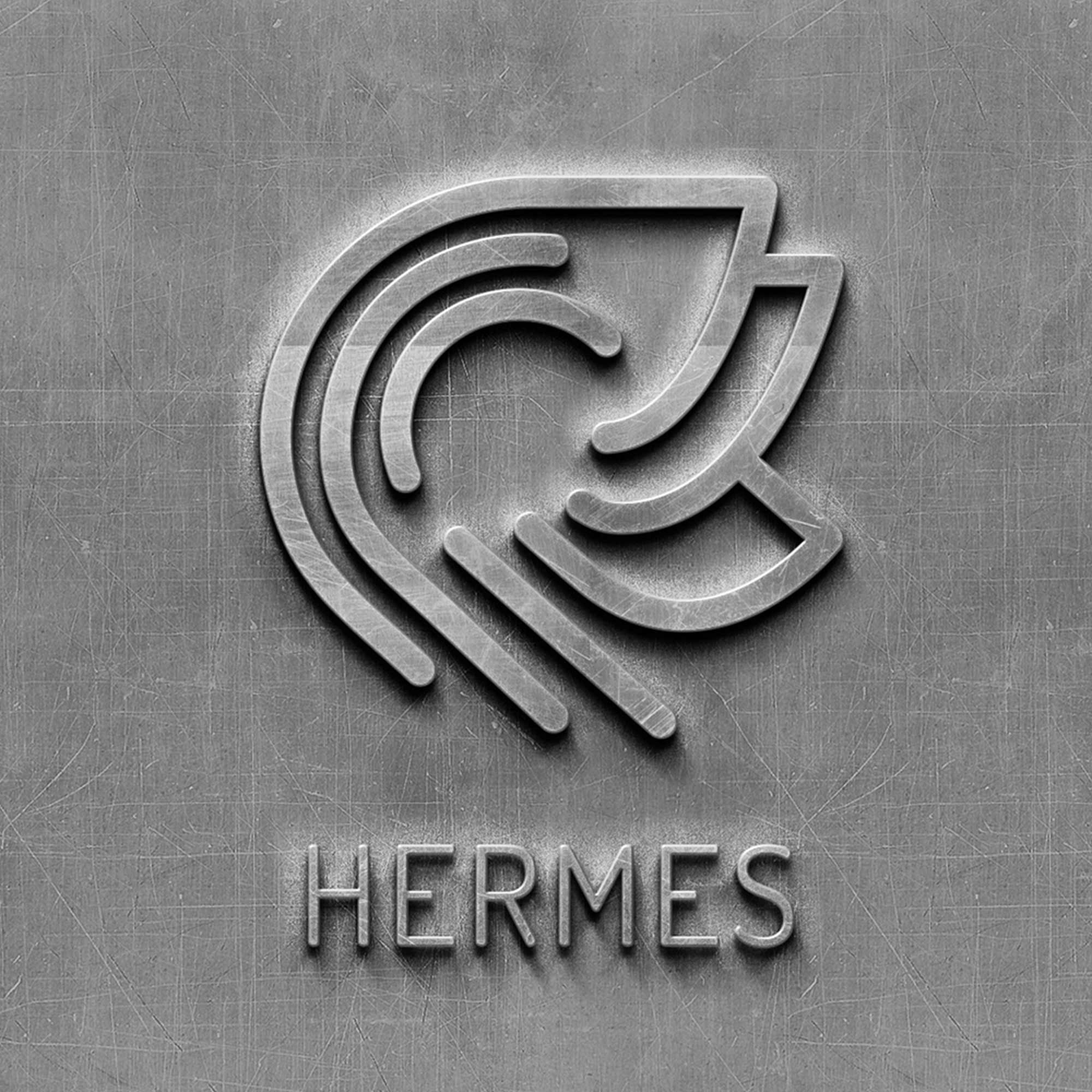
hermes

Designing for 3D printer industry
View
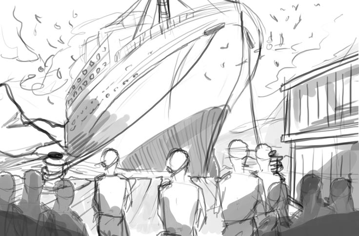
A hand-drawn tanker

Sketching a bold new website for Tamarindo Communications...
View
1

Greater Change Branding

View
1

Inkpath Branding

View
sketch

KUPU is a platform designed to promote awareness of holistic therapies and their benefits.
View
1

Designing and developing the protagonist from Hett'y's Hospital
View
1

Le Régent Crans-Montana College.

View
Care Companion Logo

A few mockups for the new Care Companion identity parade.
View
1

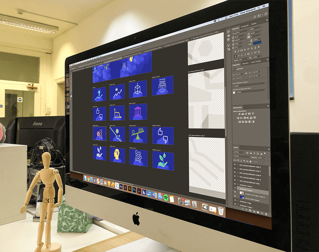
Illustrations for the Insitute for New Economic Thinking.
View
wga

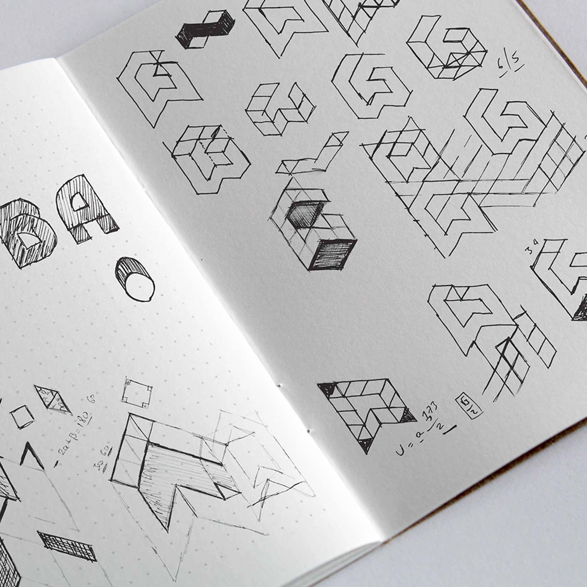
William Green Architects Branding and Website Design
View
animation

Marketing animation for Inkpath

View
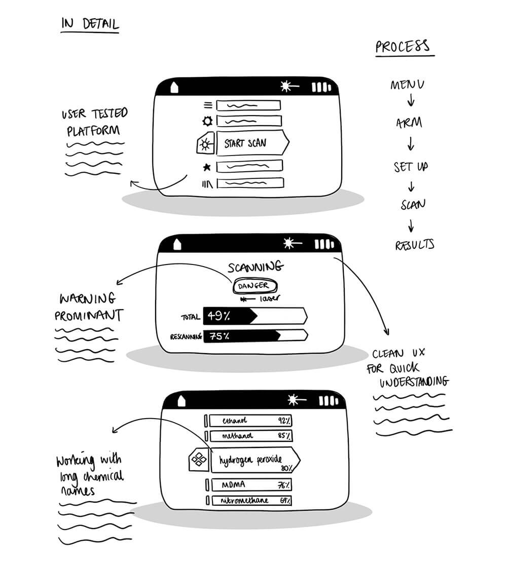
Screen scamps

Some interface sketches for a handheld scanner.
View
1

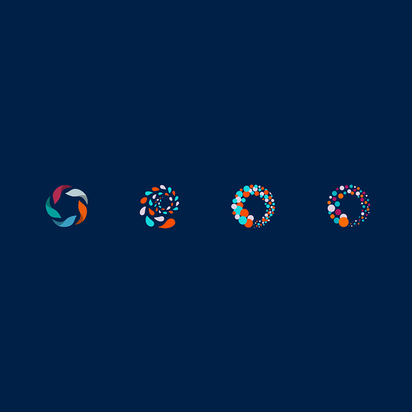
Branding for Reuters Institute for the Study of Journalism.
View
1

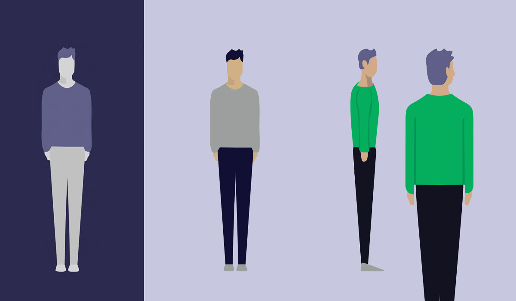
Branding and Illustrations for Paddle, a psychological therapy support tool.
View
1

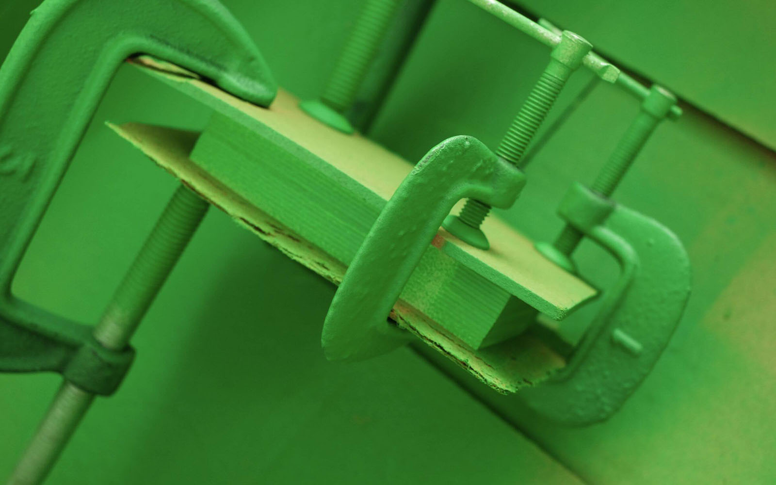
William Green Business Cards

View
ipad

Storyboarding and script development for Hetty's Hospital

View
hermes

Designing for 3D printer industry

View
Care Companion Logo

A few mockups for the new Care Companion identity parade.

View
1

Branding and Illustrations for Paddle, a psychological therapy support tool.
View
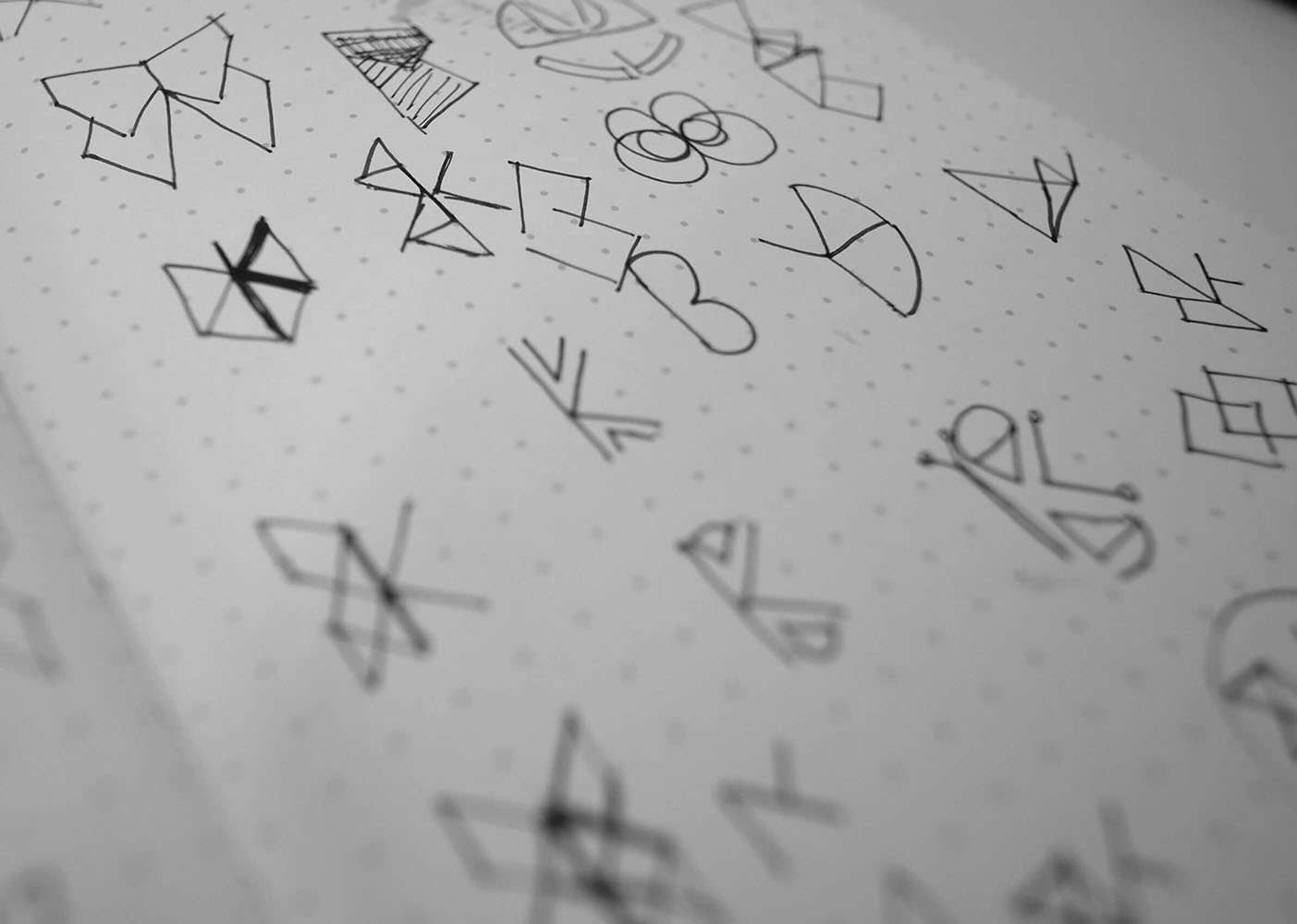
sketch

KUPU is a platform designed to promote awareness of holistic therapies and their benefits.

View
1

Le Régent Crans-Montana College.

View
1

Branding for Reuters Institute for the Study of Journalism.
View
1

Inkpath Branding

View
animation

Marketing animation for Inkpath

View
Screen scamps

Some interface sketches for a handheld scanner.

View
1

Greater Change Branding

View
wga

William Green Architects Branding and Website Design
View
ipad

Storyboarding and script development for Hetty's Hospital

View
A hand-drawn tanker

Sketching a bold new website for Tamarindo Communications...

View
1

Illustrations for the Insitute for New Economic Thinking.

View
1

William Green Business Cards

View
1

Designing and developing the protagonist from Hett'y's Hospital

View

Hermes extruder

e-3D trusted us for the branding of their new "Hermes" 3D printer extruder. We got inspiration from the shape of the innovative heat sink attached to the device, and added the winged feeling of Hermes. Very exciting to be printed on industrial products.

Le Regent Marketing

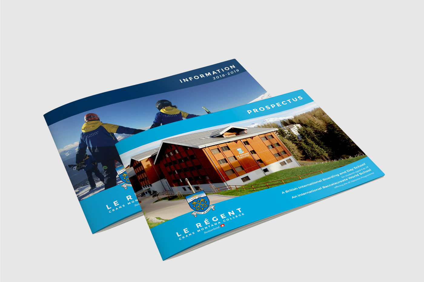
The ink has just finished drying on these brochures for the next round of pupils into Le Régent Crans-Montana College.

Claire Veatriki

Cobalt Resolve

Cobalt Light makes scanning equipment for government agencies and related security providers. They make several versions of scanner, one of which is a handheld device to scan the contents of suspicious objects.

Gareth

Gareth

Director

Tamarindo Sketches

We're doing some visual planning for the website of a new client, Tamarindo Communications, a renewable-energy focussed PR firm in Oxford. The eventual site will be a scrolling narrative, telling the story of how this energy-related PR firm came to be and how its culture affects its clients.

Gareth

Gareth

Director

Care Companion Ident

Ident for brand values; supportive, friend, resourceful, library, guide.

Ultimately, the brand message is; "For carers & the cared for."

Niki Ben

Reuters Institute for the Study of Journalism

The brief was to design a logo that would achieve three things: complement the Oxford University logo it would sit alongside, nod to the branding of the department’s primary sponsor, and retain an individual character. 

After narrowing down the concept design, we could experiment with colour combinations, and refine the shape. We developed different versions of the logo to be used at small sizes - for example on the spine of a journal. We created accessible brand guidelines that could be easily used by designers and non designers. The final logo reflects the constantly moving and evolving nature of the Reuters Institute. It is dynamic and relevant, and is continuously adapting to an ever changing world.

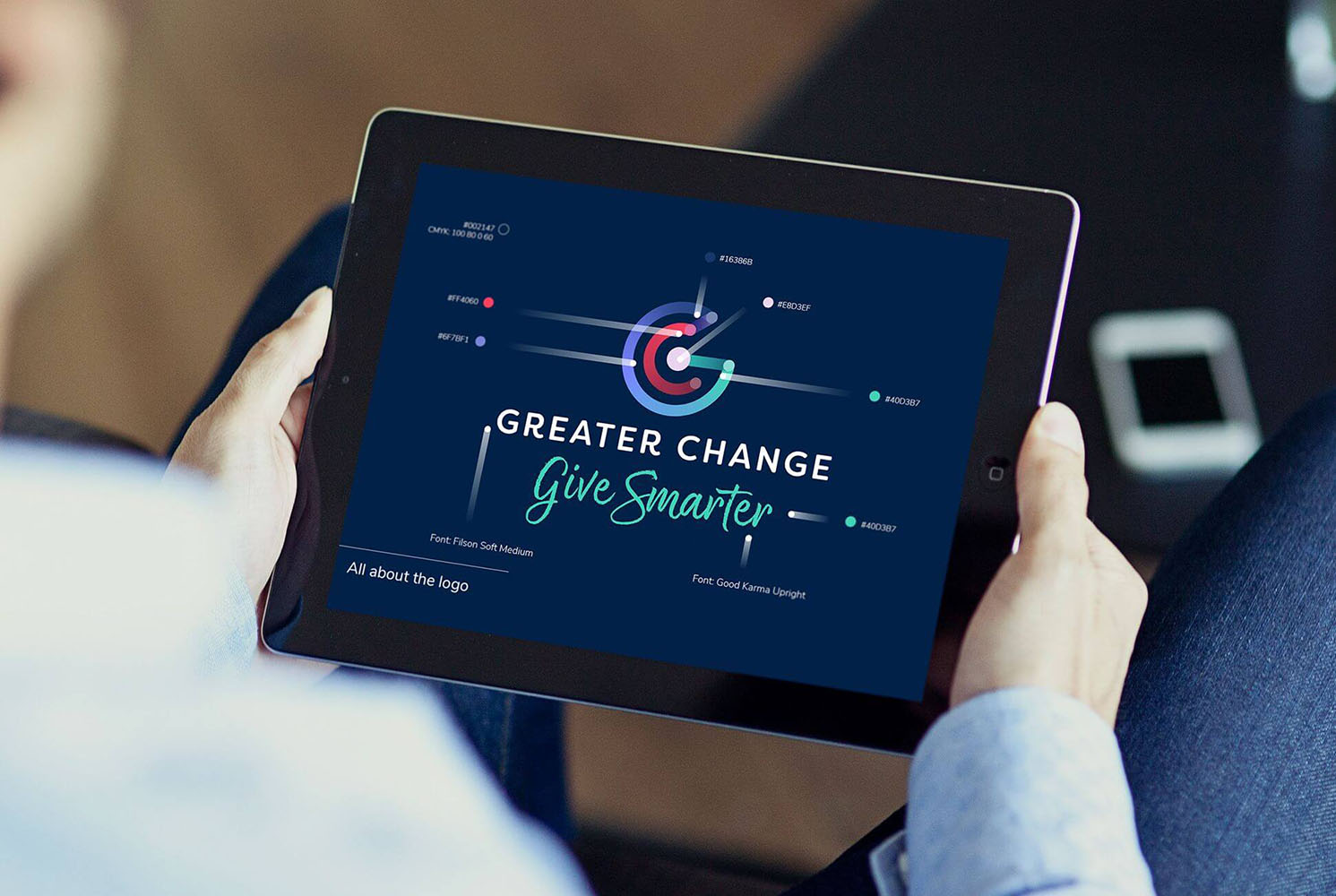
Greater Change

We're trying to bring the cash-free giving tech the fluidity and accessibility it needs to encourage strangers to donate to rough sleepers.

Niki

Niki

Designer

INET

We were asked to design nine icons to represent INET's nine main research themes. The challenge was to bring nine very different ecumenic themes together and incorporate them under one style that was recognisable and yet distinguishable. Alongside the main themes, we were also asked to design icons for the 5 programme teams including ‘Complexity Economics’, ‘Economics of Sustainability (EOS)’ and 'Ethics and Economics’. With such challenging and abstract imagery to work with, it took time to narrow down the essentials of each theme and what was really needed to communicate the meaning.

Paddle Branding

Paddle is a platform providing a space for users to securely store their own session notes and other useful materials during a round of psychological therapy at an IAPT service. The brief was to come up with a name for the platform, and support it with extensive branding. This was a playful branding project, and allowed us to not only explore different names for the brand, and how they could be interpreted, but how supporting imagery could project the brand further.  After workshops and meetings with the client, 'Paddle' was agreed upon for the name of the app. It represented buoyancy, safety, movement and progression, and encompassed the feel of the apps intentions. We now had the inspiration for the logo itself and so explored and experimented with paddle-like themes until the final logo was decided upon. The app itself was divided into four main areas, 'My Therapy', 'Library', 'Staying Well' and 'Questionnaires', and so we developed four 'Paddle people' to compliment each area, bringing the app to life.

Veatriki

Veatriki

Designer

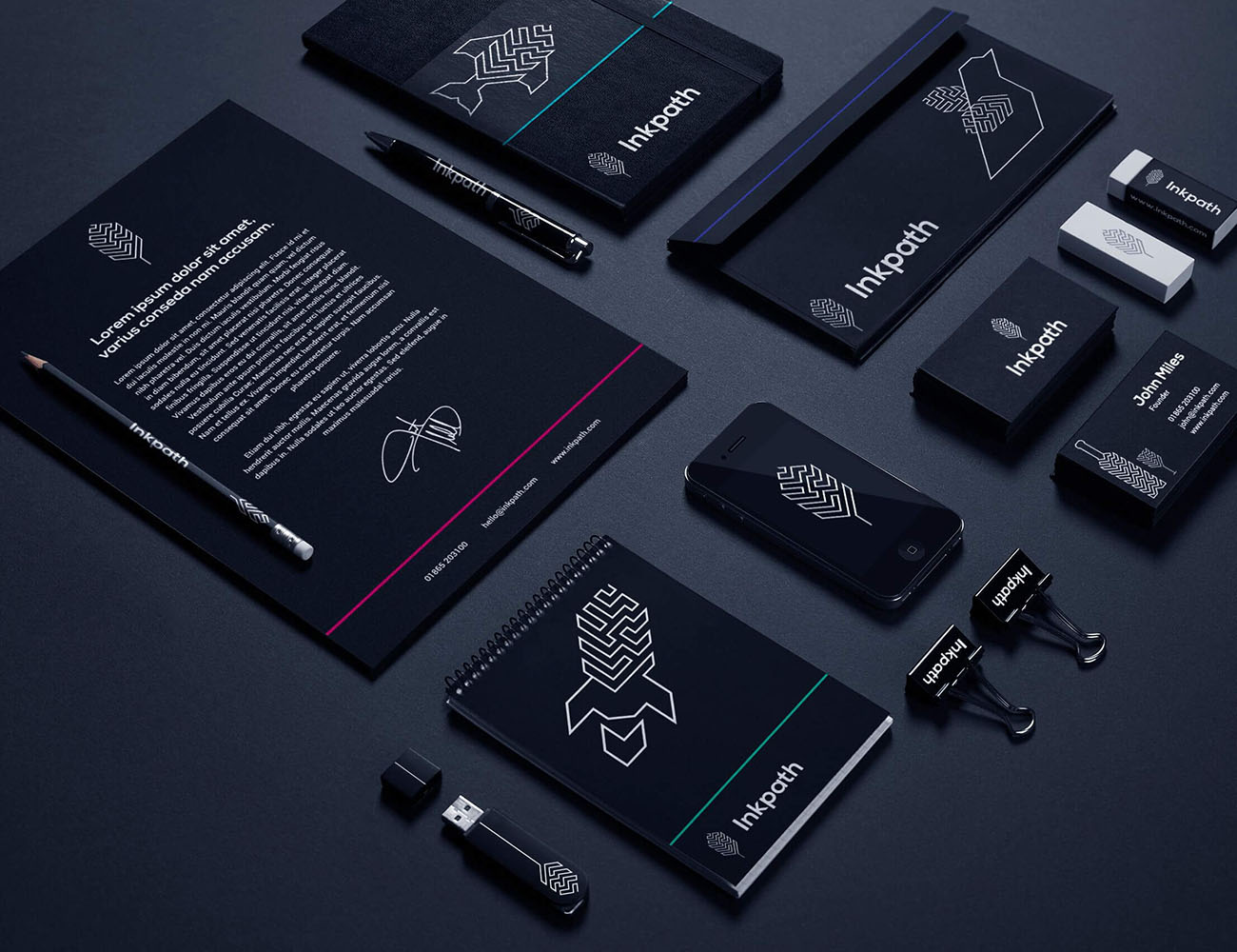
Inkpath

Inkpath is the first comprehensive, data-driven software platform to help its users plan and track their career development in a smart format, giving users a profile for life and placing their mobility at the core of its mission. Our brief was to create a brand that reflected core themes of growth, aiming towards somethings bigger and the idea of a path full of purpose and direction. 

Niki

Niki

Designer

William Green Architects

One of the key principles William green wanted to portray in the new branding was excitement. WGA pride themselves on their absolute passion for design and this was fundemental to the new website. It had to be clean in function with simple, intuitive navigation. The branding had to stand out above the white noise of other architecture firms as potential clients will browse numerous architecture firm websites before deciding and so the design of the website needed to ensure that WGA was notably remembered.

William Green

William Green Architects business cards? Simple yes? Well we wanted to do something a little different for this client. William Green's signiture green couldnt be left out of their business cards design of course, but when we wanted to have each card edged with bright green and the printers didn't have the green avaiable to print, we had to come up with an alternative solution. We sourced the perfect green in a spray paint can, clamps and spray paint booth and got to work! The process was particular, and one run from the spray paint could cost us a batch of cards, but with practice and patience we had created a business card totally unique in its field. We loved working with raw materials and getting our hands dirty and are biting and the bit to do it again.

Veatriki

Veatriki

Designer

KUPU Branding

KUPU is a platform designed to promote awareness of holistic therapies and their benefits, and book these therapies through an app. The brief was clear: The branding should be gender neutral, modern and strong. With competitive companies in the midst, the look and feel of the brand should be distinctive, bold and original. The name of the platform ‘Kupu’ means butterfly in Indonesian, and so this gave us a good starting point in terms of imagery. With the brief being very clear in aiming towards a gender neutral feel, we had to be abstract in our approach.

Inkpath Animation

The focus of this animation was to show how the user could benefit from using Inkpath. It depicts how Inkpath can help you take the right steps to achieve the career you have in mind. We started with Sam, our star of the show, who represented users of Inkpath that wanted guidance and illumination on the gaps in their career path. We developed a storyboard and highlighted key features of the app through engaging animation and a script that married both the visuals and the intent of the video perfectly together. By keeping in-brand, and considering a simple approach to communicate in the best way, we created a informative and engageing marketing video for use both on Inkpath's website and social media.

Hetty's Hospital

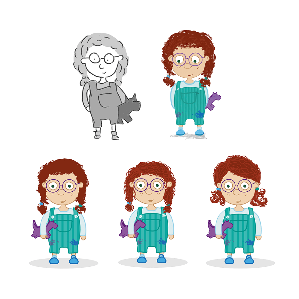
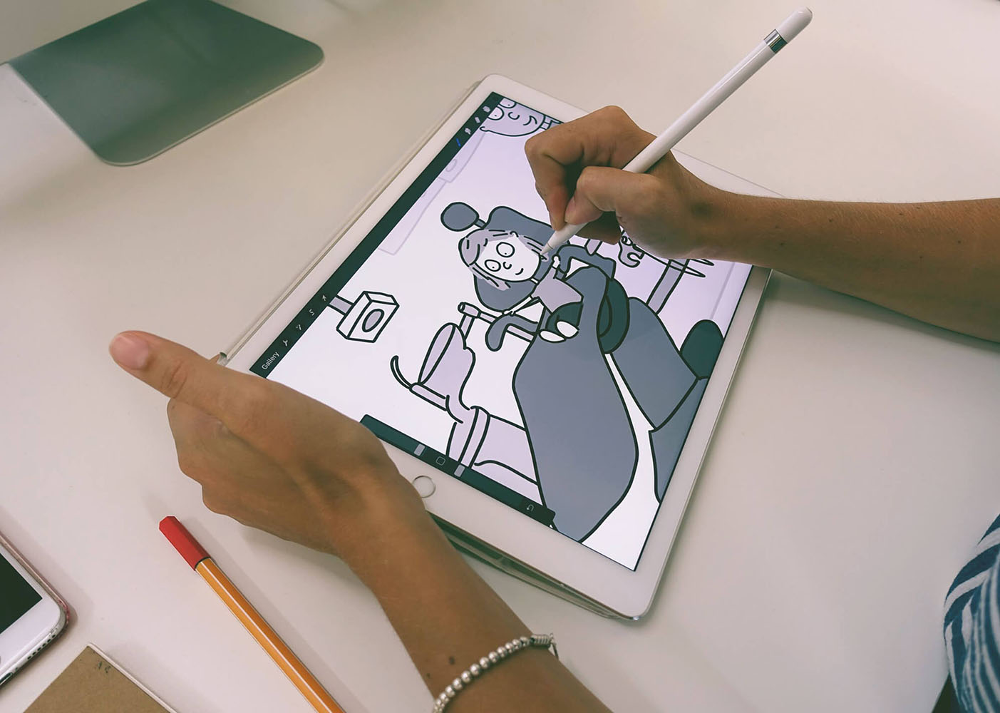
From pen to paper, then vectors and onto animation. The process to create a Hetty storyline is detailed, polished and perfected, but it all starts with lots and lots of sketches. First we discuss with our clients the characters traits and personalitiy, what the main focus of their story will be, and what interactions and games we want to integrate into their timeline. Having a detailed medical background is invaluable to the character development process and is crucial in how the animations will be formed, and making sure each scene is medically correct.

Hetty Hospital


The brief:

An App designed for children aged 4-8 years exploring the hospital environment. Our main character should be about 6 years old with ginger curly hair in pigtails. She should be cheeky, inquisitive, a Tom-boy, likes the outdoors and inseparable from her little teddy.

We had a specific brief but ran with it head on. We polished each version and iteration after iteration we finally discovered our Hetty!

Niki

Niki

Designer